Thursday, 29 November 2012
Tuesday, 27 November 2012
Tuesday, 20 November 2012
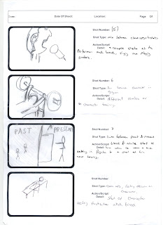
Story Board Copy 1
Here is our rough copy of our story board.
This is our first draft of it, so it is very rough and does lack some detail. However it does provide us with enough information to start filming some shots.
Friday, 16 November 2012
Shot Type Ideas
I got inspired by a training video of an Olympic weightlifter and had the idea of using a couple of the shots in our music video. The range of close ups and establishing shots really worked well in the video so we would like to recreate this in our music video.
We also had the idea of having the first half of the video in black and white when the character is failing to succeed, but as he becomes stronger and more motivated the shots become in colour.
Similar to this idea, we are going to have the first half of the video containing a lot of high angle shots to make the character looked down upon and weak. But as he becomes more motivated we will do a range of low angle shots looking up at the character who will seem powerful and successful.
Thursday, 15 November 2012
Magazine Advert
For this advert I took a slightly less conventional approach to it. As our video is going to be based around a boxer trying to succeed, I was inspired by a boxing poster I saw (above) and decided to do my advert in the same theme.
This makes my advert more of a poster, in the style of a boxing poster but with all the information needed for a new release album.
This is very catchy and sets the theme of the song and video.
However, this is just a draft and therefore I have used pictures of famous boxers - if I was to use this style of advert then we will have to take the pictures ourselves.
Tuesday, 13 November 2012
Monday, 12 November 2012
Album Cover Draft 2
This is my second draft for an album cover.
This time I've gone for a more plain approach, quite like The Killers album that I analysed However I have focused the whole album around the band's name - highlighting it's importance and making it stand out. I also picked the font type carefully to fit in with the hip hop genre.
This time I've gone for a more plain approach, quite like The Killers album that I analysed However I have focused the whole album around the band's name - highlighting it's importance and making it stand out. I also picked the font type carefully to fit in with the hip hop genre.
Saturday, 10 November 2012
Magasine Advert Draft 1
Here is my first draft of what my magasine advert will hopefully look like.
I made sure that the band name was in the largest font and stood out from everything else, this to to make it the most important thing on the cover.
I also included quotes ande ratings from other magasines on the advert, this is very conventional for a album advert.
The art work I chose is in the same theme as the art work of the album, this is also conventional.
Tuesday, 6 November 2012
Sunday, 4 November 2012
Album Cover Draft
Here is an idea I have put together of a digi-pack for our song. Here we have the front cover as well as the inside cover. the theme of the front cover is matched to the theme of the video. The idea being a silhouette of a boxer with the bright flashes of cameras behind him. This shows the fame and achievements most ambitious athletes chase after. The inside cover is the front on image of the front cover, showing the boxer and the ring behind him. This will give the audience some indication of the theme of the song and the video - motivating and inspiration.
Subscribe to:
Comments (Atom)


